
If you’re considering having a mobile version of your desktop website created, there has never been a better time to do so.
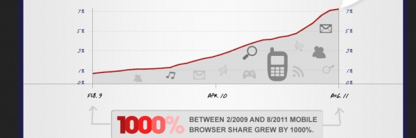
In terms of searches, the mobile web has already taken over the desktop web (and the upward trend seems like it will continue) and with 2 out of 3 searches on mobile website being done to find local businesses; a well designed mobile website can have a significant and positive impact on helping your business grow if you’re a business serving customers in a fixed geographical area (see related Infographic on the mobile web).
The needs of your mobile website users will be slightly different to those of your desktop website users and keeping in mind some simple guidelines when getting your mobile website created can help fulfil those needs more effectively and helping your mobile website give you a better ROI.
Take your online business to new heights with Flow20! Optimize with our expert eCommerce SEO, expand your reach with Bing PPC services, and dominate Google Ads. Plus, master advertising with our Google Ads training. Act now!
Here are some design guidelines to keep in mind:
Your business phone number
In my experience, I have found that conversion rates of mobile users are higher since the main goal of their visit is to get in touch with you. This perhaps makes your business telephone number the single most important piece of information of your mobile website and its important that this is clearly displayed within your mobile site.
Ideally, you should have a “Click to Call” button which will allow mobile users to call you with a single click rather than having to note your phone number down.
Avoid information-overload
Mobile users generally have a good idea as to the purpose of their visit to your site and it generally revolves around getting in touch with you, looking up your address or getting an idea of whether you can help them before they do either of first two.
You should keep this in mind when thinking of the number of pages and the amount of information you are going to put up.
Pages and content that work well:
- Home – A brief write-up about your company with a clear Click to Call button
- Services – More information about the services you offer. I don’t think each service warrants a dedicated webpage unlike desktop sites
- Request a Quote – the terminology may be different for your business (maybe, Request an Appointment or ‘Make booking’) but another Call to Action apart from your phone number is a good idea
- Contact – along with your business address, your business hours and a hyperlink to Google maps is very important. I don’t think contact forms are of much use on mobile sites but if you are going to have one, limit the number of questions to two or three and avoid any drop down options on answers as complex form features may not render well on all phones and will increase the page load speed times
Maximize your law or finance firm’s potential with Flow20! Our specialized SEO for law, SEO for finance, and PPC for law services are designed to elevate your online presence. Click here to start dominating your industry today!
Keep design “light”
You’ll want to keep the design and look/feel of your mobile website consistent with the desktop version but avoid using too many graphics, overly fancy buttons and heavy background images. All of these will make your mobile website heavy, increasing load times which can put off many users. Also, and as mentioned already, these features may not work properly on all but only the more advanced smartphones.
Avoid using too many buttons as well as using overly fancy colour schemes which could make reading difficult on a mobile device.
What I have written here covers the basics of good mobile website design and guidelines to keep in mind. For a more in-depth look check out best practices for mobile design and iphones.
If you’re looking for a digital marketing agency why not give Flow20 a try? We can help you with PPC management, Facebook ads, LinkedIn Advertising and Social Media campaigns and even Google Ads training.