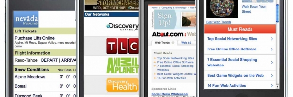
In early 2010, Morgan Stanley predicted the mobile web to become bigger than desktop web by 2015. This actually happened in 2011!The growth potential for businesses who make the most of this emerging trend is far from insignificant.
Thanks in part to the growth of tablet devices such as iPad and Kindle, coupled with constant improvements and browsing capabilities of mobile phones, consumers are using mobile devices for everything from product research and online shopping to helping make decisions on purchases even while in physical stores. According to a Google shopping study done by Ipsos OTX, 77% of tablet users made use of their device for their 2011 holiday shopping. Not surprisingly, a 2011 Google study shows that tablet owners have a higher likelihood of using the device for online shopping than even smartphone users due to the better browsing experience tablet computers provide.
Mobile Marketing
Mobile advertising is taking a significant share of the overall Internet marketing budget and in 2012, 34% of UK marketers are expected to spend between 6% and 10% of their total online marketing budget on mobile advertising alone.
Mobile Advertising is predicted to sore over the next few years.
- While spending on mobile advertising saw only a slight increase between 2009 and 2010 an unprecedented leap was experienced over the next few years and trend seems to continue.
- Mobile marketing expenditure is expected to explode by 2014, to an unprecedented £285m. The larger percentage of which will likely be spent on mobile advertising just in the UK.
The expanding popularity of smart phones and tablets is creating a surge of savvy consumers willing and eager to use e-commerce mobile sites for their purchases. This trend opens up a vast new frontier for online businesses. By exploring this promising trend sooner rather than later and before your competitors do, you could significantly increase your marketing ROI You would do well to stretch your horizons and budgets to take advantage of this golden opportunity.
How to Optimize for Mobile Marketing
It is vital, in 2012, for businesses to optimize their website for mobile access in order to optimize their mobile site in these key areas:
- Speed
- Image rendering
- Accessibility

An important point to consider is how you would like to allow mobile users to access your page. You have 3 options:
- Generating mobile optimized webpages of your current website without any change to URL
- Using dedicated mobile pages
- Having a separate sub-domain for the mobile version of your website. For example, mobile.companyname.com
A well created mobile website differs to the desktop version in some ways. If you are considering having a mobile version of your website created, here are some pointers to bear in mind:
- Your website’s mobile version doesn’t necessarily include all content from the desktop version. Think about the user intent and the information your user will most likely need having searched for and found your mobile website. IMDB is a great example of this – when viewing info about a particular movie, for example, the amount of information shown on the mobile version is significantly less and usually only contains the most important bits from the movie such as cast, year of release and so on.
- Only show the most important information from content categories (ie. Pages). For example, whereas the full version of your website’s Contact page may contain a contact form, your mobile version only needs to show the contact information and opening hours.
- If your website shows ad, you want to avoid showing these on the mobile version
Page Design for Mobile Marketing
Keep in mind; mobile devices have a different screen layout than do desktops.
- Design pages for a screen size of 320 by 240 pixels
- It is difficult for Mobile users to focus on detailed areas of your site’s design
- Clicking on small links is challenging while running for a connecting train or plane
- Add alt-tags for pictures; users tend to block downloading images in their web browsers in order to reduce bandwidth consumption.
- If you have optimized webpages for mobile interface, you can give users a mobile meta-tag such as: mobile optimized. This will alert mobile web browsers that your content does not need to be minimized.
According to Mobile Marketing Association – The extraordinary growth of smart phones in combination with their exceptional user interface will enable people to use conventional websites on their handsets. Direct business-to-consumer apps can be delivered using traditional Web tools as well as Web adaptation tools. As smart phone and tablet saturation permeates online marketing, the mobile user now possesses the technology to access quality content on their mobile devices making this medium quite advantageous for marketers.
For more information on our Website Design Services and how we can help you grow via the mobile web, email create@flow20.com or call 0208 133 0754.
If you’re looking for a digital marketing agency why not give Flow20 a try? We can help you with PPC management, Facebook ads, LinkedIn Advertising and Social Media campaigns and even Google Ads training.


